索拉设计 Boooard生活空间 第三百七十六篇 _20251018
2025-10-18 13:35


生活
艺术
互为共创

SORA® 以「互为共创」的创新协作模式,与客户共同创造文化多样性、商业持续性的品牌系统;产品包含商业策略、创意策划、品牌设计、空间设计、建筑改造、文化策展等生态服务;以创新塑造更美好的品牌叙事,提供有创造力的解决方案,注入有前瞻性的品牌动能。
01
设计实景

Design reality
Boooard是一个以冲浪为灵感线索的滨海策展生活品牌;以在地海岸线为行为据点,提供从全日咖酒、冲浪生活到运动策展的岸板生活体验;SORA®负责该项目的全案设计服务。Boooard的灵感来源于冲浪运动的载体——冲浪板「Board」,在这里它不仅是感受自然流动的海陆浪板,也是链接日常生活的餐桌与社交的聚台,是为一处兼合餐饮零售与策展的多元生活「岸板」。
Boooard is a coastal curatorial lifestyle brand inspired by surf culture. Rooted in the local shoreline, it offers a comprehensive “shore-board” living experience that integrates all-day coffee and cocktails, surf culture, and sports-themed curation. SORA® provided full-scope design services for this project.
▼外观概览
exterior overview


▼开敞的立面
open facade


▼立面细节
façade detalis


基于理念之上进行品牌的设计延展,LOGO融入了前进的岸板与海浪波动起伏的状态及形态去做了设计思考;品牌图形也是用抽象和不规则的海水形态去汇成品牌的每一个动态,可以组合使用也可单独进行使用,颜色也用了海浪夕阳和活跃的荧光色进行结合,使整个品牌的调性,表现出即使不在海边也能让大家感受到仿佛在海边冲浪的休闲感。
Guided by this concept, the brand identity extends into its visual expression. The logo incorporates the forward motion of a board and the dynamic undulation of ocean waves. Supporting graphics abstract the fluid, irregular forms of seawater, creating a flexible visual system that functions both as composite patterns and standalone elements. A color palette combining sunset-ocean tones with vibrant fluorescents evokes a casual, surf-side leisure vibe—bringing the coastal relaxation experience inland.
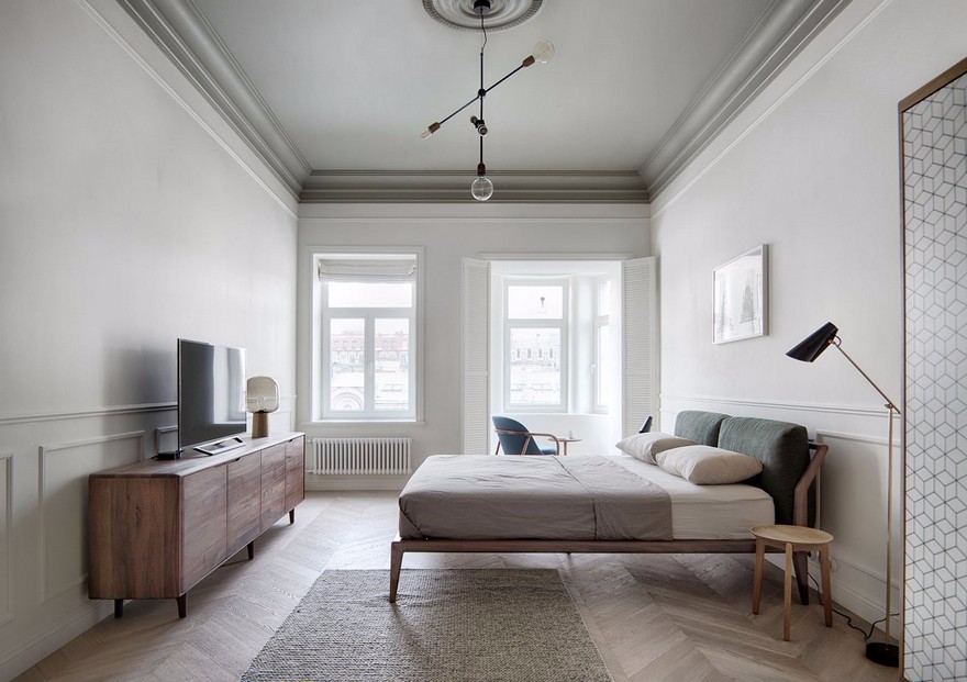
▼入口看向室内空间
entrance view to interior space

▼室内零售空间
retail zone


▼咖啡区
café zone


Boooard的空间整体是流动开放的,布局上使用环形动线,大量使用弧线的动线让空间更流畅,我们使用一条长型单边户型吧台加上背部立面的大型吊柜成为空间的主体和中心;再以入门处室内外衔接处的背靠背长椅与吧台前的区域、三角形的大长台为空间内的三个实体支点,形成整个场的虚实关系和层次感。
The name Boooard draws inspiration from the surfboard—the essential vehicle of wave-riding. Here, it transcends its natural element to become a dining table for daily life and a social platform for connection, evolving into a versatile “shore-board” space blending F-B, retail, and curated exhibitions.
▼弧线的动线
curve circulation


▼弧形家具
curve furniture

正门的外摆使用多种不同状态的座椅方式,中间的圆椅使用中心环坐的方式表达随停随坐的松弛状态,加上滑板站台,整体外摆呈现出自由自在的松弛感。
The outdoor seating area encourages relaxation with varied seating arrangements, including circular benches for spontaneous gatherings and skateboard-style stands, fostering an atmosphere of free-spirited ease.
▼冲浪元素的运用
surfing elements


▼丰富的色彩
vibrant color


靠商场内的入口处为零售区,前方是使用蓝、红色的铝方管连接器加上万向轮组合而成的饰品区;后方的服饰区域,使用了两块呈45° 角度的冲浪板链接钢架作为衣架杆,加上吧台与吊柜延伸出来的收纳区域,再使用冲浪板形状的试衣镜,形成一个丰富多彩、轻松亲昵的零售氛围。
Near the mall entrance, the retail zone begins with a jewelry area featuring blue and red aluminum connectors and casters, followed by an apparel section where surfboards mounted at 45° angles serve as clothing racks. Together with storage extensions from the bar area and a surfboard-shaped fitting mirror, the retail space delivers a vibrant and inviting atmosphere.
▼细节
details


02
创作团队
Creative team
项目名称:Boooard
项目类型:餐饮
设计方:SORA
公司网站:https://www.sorabrand.com
联系邮箱:info@sorabrand.com
项目设计:2025
完成年份:2025
设计团队:SORA
项目地址:深圳市南山区文心六路4号Kaledo负一层
建筑面积:室内面积:190m² 外摆面积:75m²
摄影版权:SORA
施工方:惠州市恒众装饰有限公司
摄影师:郑浩强
客户:Boooard
材料:多层板、木皮、水磨石、大理石、手工砖、真石漆、铝通烤漆、不锈钢、条纹布
设计共壹体
索拉设计
SORA® 以「互为共创」的创新协作模式,与客户共同创造文化多样性、商业持续性的品牌系统;产品包含商业策略、创意策划、品牌设计、空间设计、建筑改造、文化策展等生态服务;以创新塑造更美好的品牌叙事,提供有创造力的解决方案,注入有前瞻性的品牌动能。
灵魂、心灵、文学,都在求知,求真,求实,而设计思想的出路是在知识中凝聚成长。设计共壹体应运而生,长于文化的土壤,乘风破浪,一路上探索好的内容,报道好的内容,创作好的内容,让好的内容成为自身进阶最舒适的滋养。欢迎大家关注我们!
服务合作:
DMEDIA2023@163.COM
投稿合作:
DMEDIA2023@163.COM


推荐作品
相关文章
-
2018年走过了四分之一,LOGO设计趋势也清晰了LOGO设计
-
2018年走过了四分之一,LOGO设计趋势也清晰了LOGO设计
-
2018年走过了四分之一,LOGO设计趋势也清晰了LOGO设计