Hufft creates welcoming, innovative office space for leading leasing company Mac Properties Hufft为租赁公司的MAC属性创造了热情、创新的办公空间
2019-09-11 18:02
In the heart of Kansas City, Missouri, creative design teams at Hufft have recently completed an overhaul and redesign of the full office space occupied by neighbourhood leasing company Mac Properties.
在密苏里州堪萨斯城的中心,华夫的创意设计团队最近完成了由邻里租赁公司MAC属性占用的整个办公室空间的大修和重新设计。
Part of the goal with this office redesign was to set the company apart from others in its field. What marks the real difference in terms of their actual work is that they are much more dedicated than many other multi-family property development agencies to preserving what’s already there and working.
这一办公室重新设计的目标之一是使公司有别于其所在领域的其他公司。真正不同的是他们的实际工作是,他们比许多其他多家庭的房地产开发机构更专注于保存已经存在的东西并发挥作用。
Where other companies might start from scratch and implement what they think is best in place of what exists, Mac Properties would rather improve existing infrastructure and enhance the potential of neighbourhoods they already think are beautiful. In their office redesign, executives opted to apply the same values and principles; rather than moving entirely or totalling and restarting with the entire space, they opted to work with what was already good about the spot they had.
在其他公司可能从零开始实施他们认为最好的取代现有的东西的地方,Mac Properties宁愿改善现有的基础设施,并增强他们认为已经很漂亮的街区的潜力。在重新设计办公室时,高管们选择了同样的价值观和原则;他们选择的不是全部或全部,而是从整个空间重新开始,而是选择与他们已有的好地方合作。
This decision to honour the old space and simply reinvigorate it was partially due to the spot’s history and a desire to preserve some elements of that. Before it was inhabited by Mac Properties, those same office spaces were used by IBM. There were, therefore, all kinds of great things about the rooms and what they offered that designers wanted to work with rather than abandon.
这一决定尊重旧的空间,并简单地振兴它,部分是由于地点的历史和希望保留其中的一些因素。 在 MacProperties 居住之前,这些办公空间被 IBM 使用。 因此,房间里有各种各样的伟大的东西,他们提供的东西,设计师想要与之合作,而不是放弃。
From the outset, the whole concept the new office’s design was based on was centred around and focused upon the idea of fostering community. The building’s residents are top priority in all the plans for the office, which revolves around connectivity and fostering a welcoming and interesting but homey atmosphere that makes them comfortable.
从一开始,新办公室设计所依据的整个概念都围绕着培养社区的想法。这座大楼的居民在办公室的所有规划中都是最优先考虑的,这些计划围绕着连通性和营造一种令人愉快、有趣但又温馨的氛围,让他们感到舒适。
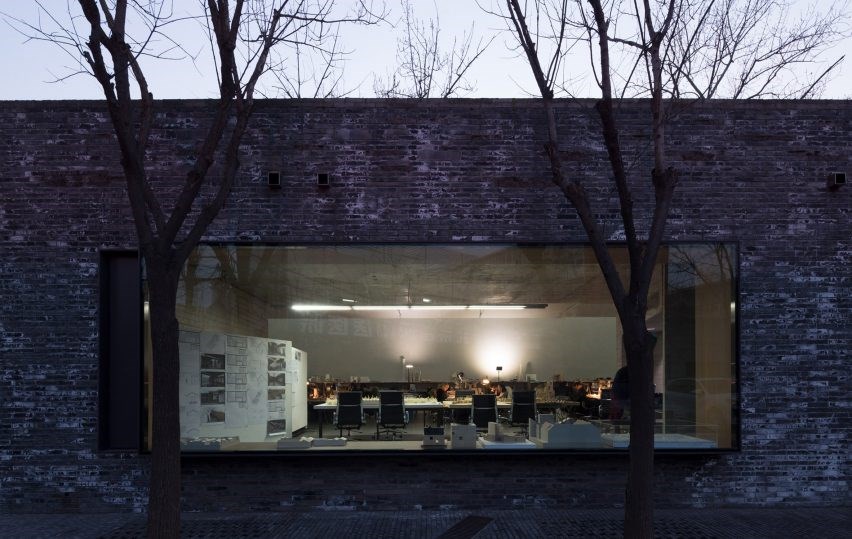
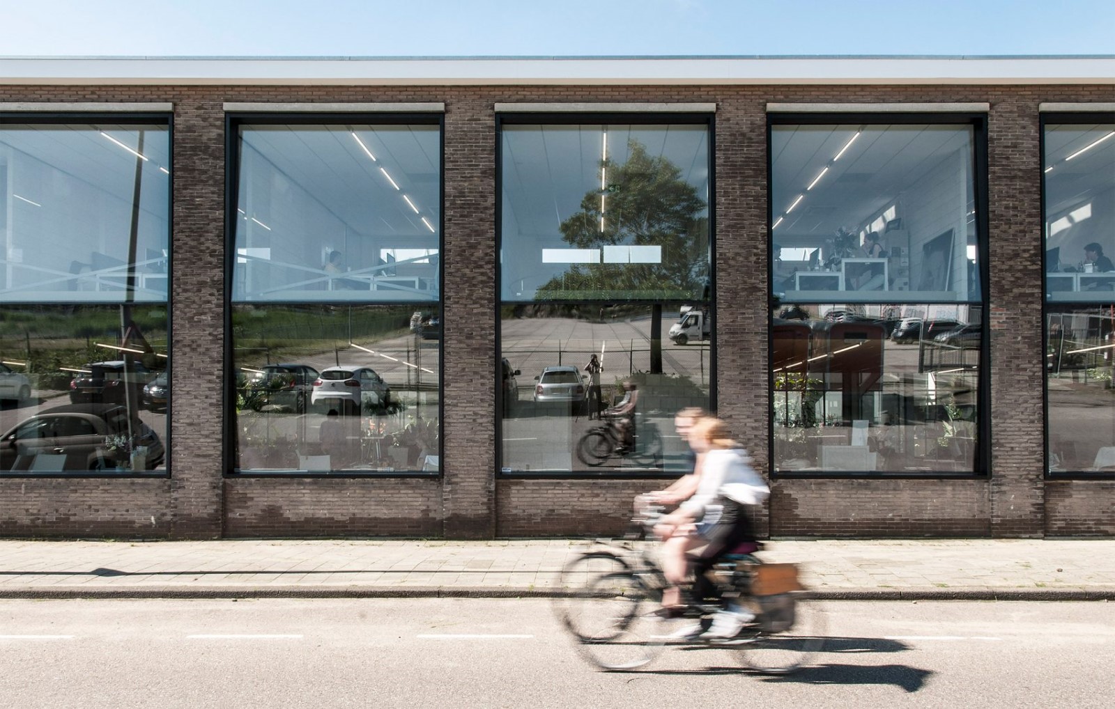
The office sits on the first floor where it is easily accessible to everyone who might need to visit. It is wrapped on nearly all sides in glass in order to create a sense of seamlessness between the exterior street level where the neighbourhood the building is in lies and the interior lobby space is. This is just one element of the office that puts the whole central idea of connectivity into actual action.
该办公室位于一楼,每一个可能需要访问的人都很容易进入。它用玻璃包裹在几乎所有的侧面,以创造一种无懈可击的感觉,在外面的街道层,在附近的建筑在谎言和内部大厅空间是。这只是办公室的一个要素,它将整个连接的中心理念转化为实际行动。
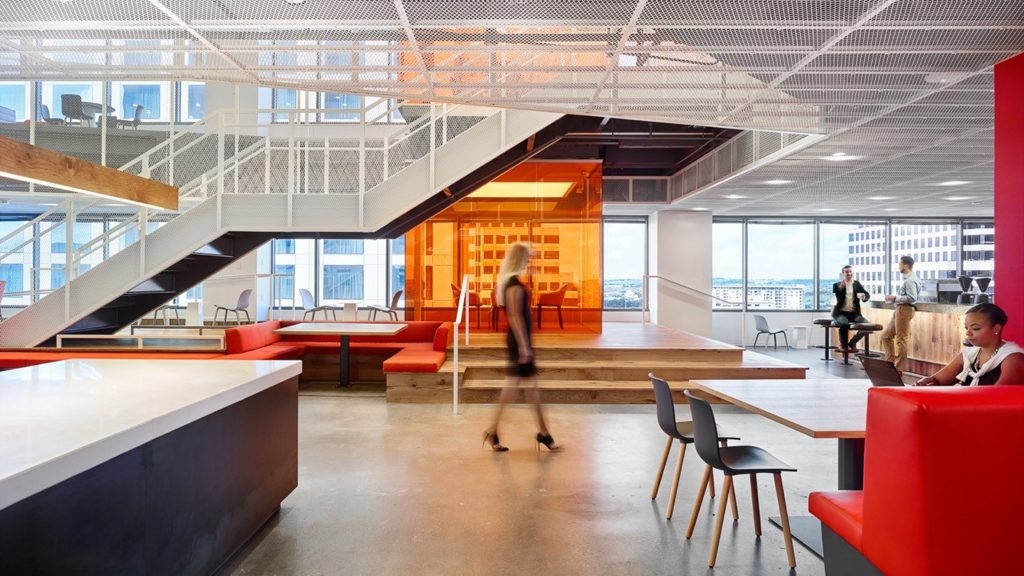
Although executives wanted to build a space that looks impressive and upscale, reflecting the quality of product and service provided by the company, they also wanted to make sure the space is an inviting one. That’s where the playful use of colour came from! The waiting space by the front desk features comfortable lounge seats and boasts a sense of warm hospitality designed to give potential new residents having their first meetings get a taste of the comfort and friendliness that might become used to living in the building.
尽管高管们希望建立一个看上去令人印象深刻和高档的空间,反映公司提供的产品和服务的质量,但他们也希望确保这个空间是一个吸引人的空间。这就是玩乐地使用颜色的地方!前台旁边的等候空间配有舒适的休息室座位,并有一种热情好客的感觉,旨在让潜在的新居民在第一次见面时,能感受到可能习惯于住在大楼里的舒适和友好。
Having been in the business for so long, Mac fully understands that some conversations surrounding new home leasing can be sensitive, so certain spaces were built with this in mind. Now, the usual process for potential residents is to visit the “property bar”, a casual and friendly public space where photos and information outlining different rental options can be laid out and perused in a way that is fun and feels low pressure.
在做了这么长时间的生意后,Mac完全明白,关于新房子租赁的一些对话可能是敏感的,因此某些空间是在考虑到这一点的情况下建立起来的。现在,潜在居民通常会参观“物业吧”,这是一个休闲而友好的公共空间,在这里,人们可以一种有趣和感觉轻松的方式,展示和浏览概述不同租赁选择的照片和信息。
After the options have been laid out, when it’s time to have more serious conversations about finances and contractual elements, designers built a separate space that gives small parties a little more privacy and a sense of quiet formal intimacy. Past the property bar lies a series of booths with break room amenities, specifically catered to discussing personal details and expectations.
在这些选项被规划好之后,当是时候对财务和合同内容进行更严肃的讨论时,设计师们建立了一个单独的空间,让小派对有更多的隐私和一种安静的正式亲密感。穿过酒店酒吧的是一系列设有休息室设施的摊位,专门为讨论个人细节和期望提供服务。
These two spaces are actually beneficial for and available for use by current residents already living in the building as well. The break services and lounge area, in particular, are advertised throughout the building’s inner community as an after-hours social space where people can come to meet their neighbours and get to know other residents.
这两个空间实际上是有益的,并可供目前居住在建筑物内的居民使用。休息服务和休息区,特别是在整个大楼的内部社区的广告,作为一个业余社交空间,人们可以来会见他们的邻居,并了解其他居民。
Perhaps our favourite visual element of this dynamic office’s space is the artistic ceiling feature in the lobby space and welcome area. This custom feature is build from pieces of wood trim that are anchored individually above the property bar and painted different bright, beautifully contrasting colours on their cut end. This piece helps define the space and contributes to a cohesive colour scheme that flows nicely throughout the entire space.
也许我们最喜欢的视觉元素,这个充满活力的办公室空间是艺术天花板的特点,在大厅空间和欢迎区。 这个定制的功能是由木饰条单独锚定在属性栏上方,并在它们的切割端涂上不同的明亮的、美丽的对比颜色。 这一部分有助于定义空间,并有助于一个衔接的颜色方案,在整个空间中很好地流动。
Photos by Michael Robinson
 举报
举报
别默默的看了,快登录帮我评论一下吧!:)
注册
登录
更多评论
相关文章
-

描边风设计中,最容易犯的8种问题分析
2018年走过了四分之一,LOGO设计趋势也清晰了LOGO设计
-

描边风设计中,最容易犯的8种问题分析
2018年走过了四分之一,LOGO设计趋势也清晰了LOGO设计
-

描边风设计中,最容易犯的8种问题分析
2018年走过了四分之一,LOGO设计趋势也清晰了LOGO设计


 PintereAI


