Dayuan大宛设计丨RERY 时尚生活馆 首
2025-04-07 21:35


Dayuan大宛设计
RERY 时尚生活馆
//
正如理查德·佛罗里达所言:“城市的活力来自于其多样性和包容性,它为人们提供了无限的可能性。” 淮海中路见证了上海的历史与现代,盖司康公寓(Gascogne Apartments)则是其中的经典代表。由赉安洋行(Leonard, Veysseyre - Kruze)设计,这座民国建筑承载城市记忆,如今焕发新生。在这里,传统与当代交融,共同塑造城市的未来。
As Richard Florida noted, “A city’s vitality thrives on diversity and possibility.” This ethos pulses through Huaihai Road, where Shanghai’s past and present converge. The Gascogne Apartments—a Republican-era landmark designed by Leonard, Veysseyre - Kruze—now epitomize this urban alchemy. Once a silent witness to history, the structure has been reimagined as a dialogue between heritage and innovation, where preserved industrial textures meet contemporary retail fluidity. Here, tradition and modernity coalesce to shape the city’s evolving narrative.

位于盖司康公寓的RERY时尚生活馆
淮海中路的盖司康公寓(Gascogne Apartments)承载着双重文化基因——建筑本身是赉安洋行(Leonard, Veysseyre - Kruze)民国时期的经典作品,窗外正对上海音乐学院梧桐掩映的绿地。每一次漫步至此,都能感受到一种轻松与安宁交织的独特氛围,仿佛时光在这里悄然驻足。
Nestled on Huaihai Middle Road, the Gascogne Apartments embody a dual cultural heritage. The building itself is a classic work of Leonard, Veysseyre - Kruze from the Republican era, with windows overlooking the sycamore-shaded green spaces of the Shanghai Conservatory of Music. Every visit to this site evokes a unique blend of relaxation and tranquility, as if time itself has paused here.
我们期望于这个历史街区之中融合咖啡与美妆业态,打造具有时空折叠感的复合空间。项目位于副楼底层的这间店铺,大宛设计以纯粹灵活为核心理念,在保留建筑原有的沉静气质的同时,通过可移动展陈系统构筑自由变幻的体验场景,让美妆展示、咖啡品鉴与梧桐树影自然交织,形成新旧对话的生活方式提案。
We envisioned a space that merges coffee culture and beauty retail within this historic neighborhood, creating a multi-dimensional experience that transcends time. Located on the ground floor of the annex, this boutique, designed by Dayuan Design, embraces the concept of pure flexibility. By preserving the building’s serene character and incorporating a movable display system, the space seamlessly intertwines beauty showcases, coffee tasting, and the dappled shadows of sycamore trees, offering a lifestyle proposal that bridges the past and present.

RERY时尚生活馆入口
设计团队经过现场勘查,本案面临两个核心挑战:原本封闭的玻璃窗紧贴建筑边线,且与人行道之间的空间非常有限,不仅遮挡室内外视线,局促的通道让过往行人匆匆而过,难以驻足;内部空间划分也未能发挥场地潜能。
The design team identified two core challenges during the site inspection: the original enclosed glass windows were flush with the building’s edge, leaving minimal space between the structure and the sidewalk. This not only obstructed the visual connection between indoors and outdoors but also created a cramped passageway that discouraged pedestrians from lingering. Additionally, the internal layout failed to maximize the site’s potential.
有的封闭式大玻璃窗紧贴建筑边界
我们在空间上采取了“内退”的手法,形成梯形过渡区。这一“空间减法”既拓宽了街道视野,也让橱窗陈设渐次展开,吸引人们放缓脚步。其次,采用斜向布局重构空间:主入口区域通过梯形延展,打造出可灵活布置绿植、艺术装置或快闪活动的复合空间;咖啡窗口则依托斜面形成便捷的即取即走通道,兼顾功能与效率。
To address these issues, the team employed a recessed spatial strategy, creating a trapezoidal transition zone. This act of spatial subtraction widened the street view and allowed the window displays to unfold gradually, inviting passersby to slow down. A diagonal layout was also introduced: the main entrance area was extended into a versatile space for greenery, art installations, or pop-up events, while the coffee window utilized the slant to form an efficient grab-and-go channel.

店铺入口的梯形空间

概念分析
图 ©
DAYUAN大宛设
建筑的边界退让,使店铺融入街区,把更具呼吸感的公共空间留出。躲雨小憩,享受咖啡,倚栏闲谈,城市生活的温度在这里自然流动。
By receding the building’s boundary, the shop integrates seamlessly into the neighborhood, offering a more breathable public space. Here, urban life flows naturally—whether it’s sheltering from the rain, enjoying a coffee, or engaging in casual conversation.

店铺空间与街区有机融合
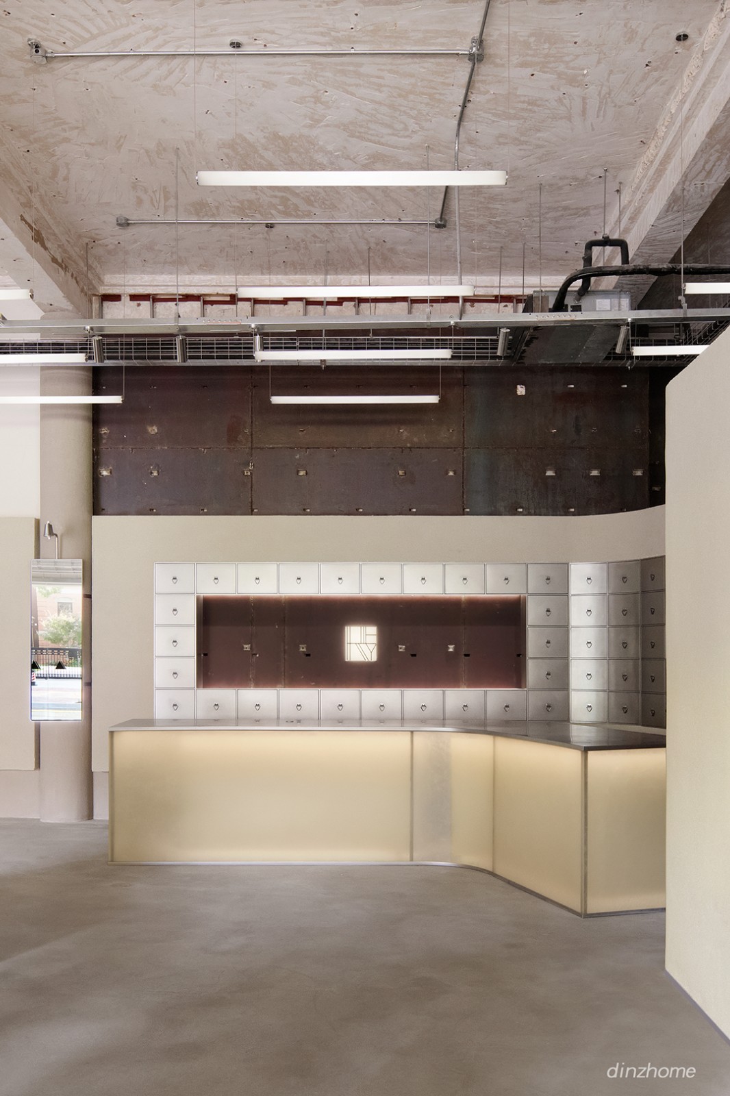
本案空间原为银行旧址,斑驳的暗红色锈蚀钢板与裸露的混凝土天花、地面构成了独特的工业记忆场域。经与委托方共识,我们选择最大程度保留这些时间的痕迹,并使之成为空间的主角,以呼应我们“简单纯粹”的设计初衷。
The space, originally a bank, features mottled dark red rusted steel panels and exposed concrete ceilings and floors, creating a unique industrial mnemonic field. In collaboration with the client, the design team chose to preserve these temporal imprints, making them the focal point of the space and aligning with the simple and pure design ethos.

暗红色锈蚀钢板与裸露的混凝土天花
面对4.3米的原始层高,沿墙增设2.6米通高矮墙系统,通过水平延展的金属框体构建视觉缓冲带,既消解空间纵向的冷峻感,又形成当代设计介入的清晰痕迹。当视线穿过新构筑的金属网格,被精心保留的锈蚀钢板墙渐次浮现——原始干挂构件经打磨后转化为兼具装饰性与功能性的界面,既是空间叙事的历史切片,亦成为划分体验动线的天然介质。
With an original ceiling height of 4.3 meters, a 2.6-meter-high low wall system was added along the perimeter. Horizontal metal frames were used to create a visual buffer, softening the space’s vertical austerity while leaving a distinct mark of contemporary design. As one’s gaze passes through the new metal grid, the carefully preserved rusted steel walls emerge—transformed from original dry-hanging components into decorative yet functional interfaces. These elements serve as historical slices of the spatial narrative and naturally divide the experiential flow.

墙体分布轴测图 ©DAYUAN大宛设计
策展型复合空间便成为贯穿全局的核心命题。这个空间既要能够容纳多个品牌的日常陈列,又具备灵活性和可变性。去匹配多品牌和举办各类快闪活动的美妆集合店的定位。
The concept of a curatorial composite space became the central theme. The space needed to accommodate daily displays for multiple brands while maintaining flexibility to host various pop-up events, aligning with the positioning of a multi-brand beauty collective.

策展型复合空间
入口处运用黄色透光树脂材质打造的灯塔装置,是品牌记忆的视觉锚点。围绕着“灯塔”,我们还设计了三组金属展架,展示各类美妆产品。当需要进行其他活动策展时,树脂板屏风可展开,与墙面的金属结构固定,为空间提供更平面的展示效果。
At the entrance, a lighthouse-inspired installation made of yellow translucent resin serves as a visual anchor for brand identity. Surrounding the lighthouse, three sets of metal display racks showcase beauty products. For special exhibitions, resin panel screens can be unfolded and fixed to the wall’s metal structure, providing a flat display surface.


“灯塔” 造型的屏风细部

“灯塔” 造型的屏风 ©
DAYUAN大宛设计
位于试妆区的黄色移动展柜,以双面设计和灵活性成为空间亮点。在活动模式下,展柜可完全嵌入墙面,最大化释放外部空间,使聚拢区域更加开阔,便于顾客流动与活动开展。
In the makeup trial zone, the vibrant yellow mobile cabinet emerges as a spatial focal point through its dual-faced design and adaptive functionality. In event mode, the unit seamlessly embeds into the wall, liberating floor space to create expansive gathering areas optimized for customer circulation and dynamic activities.


变化中的黄色移动展柜

黄色移动展柜 ©
DAYUAN大宛设计
当展柜拉开并固定于柱体时,其折叠桌面随之展开,配合精心设计的镜子,形成相对独立且私密的试妆空间。这一封闭区域不仅提升试妆体验,也为化妆活动或沙龙提供理想场所。
When extended and anchored to a structural column, its foldable desktop unfurls alongside an integrated mirror, crafting an intimate, self-contained vanity space. This convertible enclave not only elevates the makeup experience but also serves as an ideal setting for beauty workshops or private consultations—proving that smart design can fluidly balance public engagement with personalized moments.


私密模式下的黄色移动展柜

延续工业风格的洗手台
前台区域注重了与周围环境的视觉对话,并以艺术装置思维重构服务功能。暗红色锈蚀钢板与倾斜弧墙构成动态对比,粗粝金属与透光树脂板形成独特美感。弧墙的流动曲线打破方正格局,工业遗迹与当代设计在此达成默契。
The reception area is conceived as a visual dialogue with its surroundings, redefining service functionality through an art installation mindset. Dark red rusted steel panels contrast dynamically with a sweeping curved wall, while the interplay of rugged metal and translucent resin panels creates a striking aesthetic tension. The wall’s fluid arc breaks the rigidity of orthogonal geometries, forging a silent pact between industrial relics and contemporary design.

前台区域
旧钢板和不锈钢的粗犷质感,与亚克力树脂板的精致细腻相结合,形成了强烈的材质对比,使得即使身处空间深处,顾客的目光也能被轻易吸引。
A bold material juxtaposition emerges—the raw textures of aged steel and stainless steel collide with the refined delicacy of acrylic resin panels. This contrast ensures visual magnetism, drawing attention even from the deepest corners of the space.

金属与亚克力形成强烈材质对比
特别设计的互动服务台延续空间叙事——不锈钢抽屉柜模拟传统中药柜形态,顾客扫码下单后,后台通过隐藏轨道递送商品,前台完成包装交付。这套充满复古智慧的现代抓药系统,既提升服务效率,又将购物流程转化为趣味仪式体验。
The custom interactive service counter extends this narrative: a stainless steel drawer cabinet echoes traditional Chinese medicine cabinets. Customers scan QR codes to order, triggering hidden rail systems that deliver products from back-of-house for front-desk packaging—a retro-inspired modern herb dispensing system that elevates efficiency while transforming shopping into a ritualized experience.

模拟中药柜的 现代抓药 系统
空间中的另一互动装置围绕中心柱体打造,结合镜面、显示屏、不锈钢与裸露灯管,呼应入口的六边形灯塔装置。镜面吸引顾客靠近,上方摄像头捕捉现场动态,将自拍影像呈现至电子屏幕,增强人与空间的互动体验,同时拓展展示的更多可能性。也顺势将空间中单调立柱赋予更多的可能性。
Another interactive installation revolves around a central column, integrating mirrors, digital screens, stainless steel, and exposed lighting tubes to echo the hexagonal lighthouse motif at the entrance. Mirrors entice visitors closer, while an overhead camera captures real-time movement, projecting selfie images onto digital screens. This innovation heightens human-space interaction, unlocks new display possibilities, and revitalizes what was once a mundane structural element into a dynamic spatial anchor.

围绕中心柱体打造的互动装置


镜面交互装置细节
我们选择了三角形作为陈列展柜的基本形态。模数化的展台既满足日常零售功能,在策展期间也能实现灵活的搭配组合。
We adopted the triangle as the foundational form for display cabinets. These modular units fulfill daily retail needs while enabling adaptable configurations during curated events.

模数化的三角形陈列展柜

陈列柜灵活的搭配组合
与此同时,室外的花箱与展台在尺寸和形态上保持一致,唯一不同的是高度,这种设计使得它们可以相互自由组合,在室内也可以形成丰富的视觉效果。
Meanwhile, the outdoor planter boxes mirror the display cabinets in scale and geometry, varying only in height. This intentional coherence allows for interchangeable combinations, extending the design language indoors to create dynamic visual compositions. Through parametric design principles, static elements become versatile tools for spatial storytelling.
展台拉手及店铺入口门把细节

陈列柜与花箱灵活的搭配组合©DAYUAN大宛设计
陈道具采用波浪型亚克力板,在降低定制成本的同时,兼容多种美妆产品展示需求。特别是在三角形一角,我们设定了三种不同的使用场景。
The beauty display units employ corrugated acrylic panels, reducing customization costs while remaining adaptable to diverse product presentation needs. At one triangular corner, we’ve integrated three distinct functional scenarios:

美陈道具组合
基础功能是展柜配套的试妆垃圾投放口,在此之上,可选择独立的三角底座镜子或抬高亚克力展架。三者组合使用,不仅满足陈列与试妆需求,还能根据实际情况灵活调整布局。随着展柜的整体组合变化,展台的位置与功能也能随之调整,进一步增强道具的适应性与互动性。
The base configuration features a makeup waste disposal unit seamlessly integrated into the display cabinet. Building on this, users may opt for an independent triangular-base mirror or an elevated acrylic display stand. These elements can be used individually or combined, offering not only essential display and makeup trial functions but also enabling modular adjustments to spatial layouts based on evolving needs.As the display system is reconfigured, the position and purpose of each platform shift accordingly. This versatility enhances both the adaptability of the props and their interactive potential, creating a dynamic spatial dialogue between users and the environment.


美陈道具©DAYUAN大宛设计
在当下的商业环境中,零售空间正从单一的交易场所转变为富有灵活性的复合空间,重新定义消费者与品牌的关系。空间成为消费者与品牌之间互动的媒介,大宛设计通过灵活布局、创意策展和材质运用,让顾客在探索中与品牌建立更深的情感连接。零售不再只是购物场景,而是文化的集结地,一个融合展示、体验与社交的多元空间。
In today’s commercial landscape, retail environments are evolving from transactional hubs into dynamic, hybrid spaces that redefine the relationship between consumers and brands. At Dayuan Design, we transform these spaces into interactive mediums—leveraging flexible layouts, curatorial creativity, and material innovation to foster deeper emotional bonds as customers explore. Retail is no longer merely a backdrop for commerce; it has become a cultural nexus—a multidimensional space where exhibition, experience, and social engagement converge.

RERY时尚生活馆的日与夜

平面图 ©
DAYUAN大宛设计


剖面图 ©
DAYUAN大宛设计
项目名称 |
RERY
时尚生活馆
项目类型 |
商业设计
项目业主 |
上海铼锐商贸有限公司
RERY
项目地点 |
中国上海
项目面积 |
148
平方米
设计单位 |
大宛设
Dayuan Desi
gn
主创设计 |
佘宛婷
施工团队 |
上海迅朗装饰设计有限公司
道具制作 |
上海神将建筑装饰工程有限公司、上海迅朗装饰设计有限公司
展陈制作 |
上海神将建筑装饰工程有限公司
项目摄影 |
YUUUUNSTUDIO/云眠


主创设计 /
宛婷
DAYUAN大宛设计是立足于中国上海的设计公司,致力于帮助中国本土企业提升品牌价值,为其打造更富有商业性、传播性、故事性的空间、产品以及体验。大宛设计的团队善于剖析客户的商业需求,更关心客户品牌的未来发展。大宛设计相信,用设计陈述品牌故事可以帮助客户在商业世界脱颖而出,并可以在不同的媒体介质中流传得更广、更久。


推荐作品


相关文章
-
2018年走过了四分之一,LOGO设计趋势也清晰了LOGO设计
-
2018年走过了四分之一,LOGO设计趋势也清晰了LOGO设计
-
2018年走过了四分之一,LOGO设计趋势也清晰了LOGO设计